As this term has been so hectic, totting up with Nigel the other day 13 projects and counting; I've decided to do more of summary of the term so far. Some examples of projects that have gone well and others that haven't....
On our first day we were set a mini project with the aim of helping us find our way around college. We were split up into small groups and given a blank map of the college campus and told to create a 'user friendly' map which would help us remember where certain areas were in and around college. To top it off the best map would win a bottle of Cava and an (out of date) Chicken. As most people opted for the traditional colour coding method (i.e Woodwork = red, SU bar = blue and so on). We decided to be adventurous and use collage as our means of referencing. In this way we felt the idea was stronger because unlike other maps with ours there was no need for a key to be referred to. Ours worked on the simple principle that, a cig dimp = smoking area, a piece of string = textiles studio, bottle cap = SU bar and most impressive of all our own hand made miniature book to represent the library.
Despite tight competition our group won! The excerise had been a good ice breaker and helped calm initial nerves within the group, as well as helping people navigate around college more effectively.
'TEAM COLLAGE'
The first few weeks of term were definitely the most energetic. Our '10 forms of Communication' project was really good fun, composing and performing a song about Pigeons (lyrics below) was certainly one project to remember. It was challenging writing a song from scratch, certainly got a new found respect for songwriters, not only this but the dressing up (tried to be all grey like Pigeons) and performing JAZZ HANDS. These were all totally new to me and I think thats whats really great about the course; the fact it puts you out of your comfort zone really helps you to not be afraid of asking, 'Well what if... I put red with green or walk around dressed like a woman or try n fly a kite without wind' and so on. I think its fascinating and really enriched me as a person.
Our group performing the 'Pigeons' classic.
Our first whole group project was the construction of our paper map in the banqueting hall. The map was mad purely out of A4 sheets of paper stuck together with masking tape. Again this project was a semi-continuation of the 'get to know Chelsea' brief set earlier in the term. The images show the scale of the map (HUGE) and highlight the different areas which each sub-group had to research i.e my group had Grovesnor Road and around Pimlico Academy/Tube station, this basically meant the bottom left hand corner. Once completed we had to give a short presentation our areas describing, places of interest (our particular favourite Grosvenor pub where we met legendary landlord Paul who always gives free chips and onion rings to Chelsea students, hurray!) and other relevant things like cash point, digital print store etc.
our group was here ->
Our group at the Grosvenor, preparing our poster for the 'Graphics Ethos' brief
In the image above Aleena, Lucy, Richard and I are preparing for our presentation on what we believe are the 8 pillars of GDC (Graphic Deisgn Communication). These included, engage and empathise with the audience/consumer, explore and experience, voice your opinion/have your say, challenge the brief and so on. After our poster presentation we were then set probably the hardest project yet... LOGOS.
Using one or all of our ethos's we had to produce 100 logos, which for all of us was challenging. Having to use a single image or symbol to convey a product in advertising is something that takes years to perfect, we had 2 weeks. The main issue is finding an image which is pure. The image must be 'pure' in the sense it has one association or meaning to the vast majority of people i.e Ball point pen = writing, were as pencil = writing and/or drawing. So in this way the image/symbol has to be solely relevant to the message.
Once we'd presented our 100 logos these were then whittled down to 3, and eventually one which we had to refine. In my case this was 'voice your opinion' through which I'd designed (below) a loudspeaker/megaphone entitled the 'OPINIOPHONE'.
However, with being an extreme novice on Photoshop I was unable to properly design my piece and take more specific things into consideration e.g line weighting of the text, styling of the megaphone and producing more of visual impact. I've since refined and tailored the design, using my improved self bought knowledge of Photoshop.
I had too loose the 'Opiniophone' aspect to my
logo. This switched to 'Opinion Wanted'.
Final image has a no type an I've removed the finer lines
to prevent them from being ineligible in the smaller version.
This has definitely been the most intense of all the projects thus far, and the most tedious. Yet I suppose this is what its like in the big bad world of Graphic design, when a company comes to you to produce something, it takes a lot of determination and focus to see it through. Similarly with this project the need for perseverance is key, taking one step forward to take another 2,3 or even 4 back is all part of the process.
SHRINE
..................................
...................................
Another aspect of the course which I've found extremely useful has been the grouping of new people at the start of each project. Not only does this get you to talking to new people in the group far quicker but it helps you to contend with people who may have a difference in opinion and having to compromise as a result. This particularly applied to the most recent on-going project.
The aim was to give a presentation on something which you were crazy and really passionate about, so I chose MANCHESTER! My pitch went quite well, I tried to focus on my Mum's link to the Manchester music scene back in the late 70's with her contact with the likes of Joy Division and Tony Wilson's Factory records. It taught me that it is a lot harder to give a presentation 'off the cuff' as opposed to having a plan and rehearsing it, this I had failed to acknowledge in this instance.
The next stage of the project comprised of us being paired up with someone with a different passion and then to produce a 'shrine' which evoked the message of both passions e.g eggs & maths, TV & dogs. I was paired with Tshili who chose to talk passionately about cartoons, therefore our shrine = Manchester & Cartoons.
Our initial form of research was a trip to CN (Cartoon Network) in Oxford Circus. This was the hub for the British base of CN which had a similar layout to an advertising agency office. In the department they covered all aspects of CN's cartoon shows, from the marketing and advertising to the production of the shows. Tshili had managed to get us a chat with one of the MD's who kindly sat us down at his desk which was hoarded with dozens of cartoon figures, cutouts and coffee mugs and gave us a low down what they work did.
Towards the end of the tour we were shown a clip of an unseen show which was still to air. An episode of a new show called Gumball, in which animation meets reality. The short clip gave us a idea for potentially incorporating an iconic Manchester scene with the cartoon character element. Therefore we booked our tickets for a trip to Manchester to try and gain some more images and references.

Whilst in Manchester we made sure to get dozens of images as we felt any one could produce a new idea. The Manchester ship canal was something we found interesting, Piccadilly gardens with its fountains and statues was another. However, our most productive visit was to the Cornerhouse on Oxford Road where they were holding an exhibition on an artist from Lahore in Pakistan called Rashid Rashid Rana (http://www.cornerhouse.org/art/art-exhibitions/rashid-rana).
Cornerhouse in Manchester.

 This was one of Rana's most well composed pieces. Here, using his photo montage technique he portrays five women
in there Burqa's. Yet upon closure inspection the women are actually constructed out of snap shots from porno-
graphic and erotic movies. This piece carries a really power message about the way women are perceived in different
cultures, the way that one is so universally separated and etched and that slightly one strives to have the
constraints/freedom of the other.
This was one of Rana's most well composed pieces. Here, using his photo montage technique he portrays five women
in there Burqa's. Yet upon closure inspection the women are actually constructed out of snap shots from porno-
graphic and erotic movies. This piece carries a really power message about the way women are perceived in different
cultures, the way that one is so universally separated and etched and that slightly one strives to have the
constraints/freedom of the other.
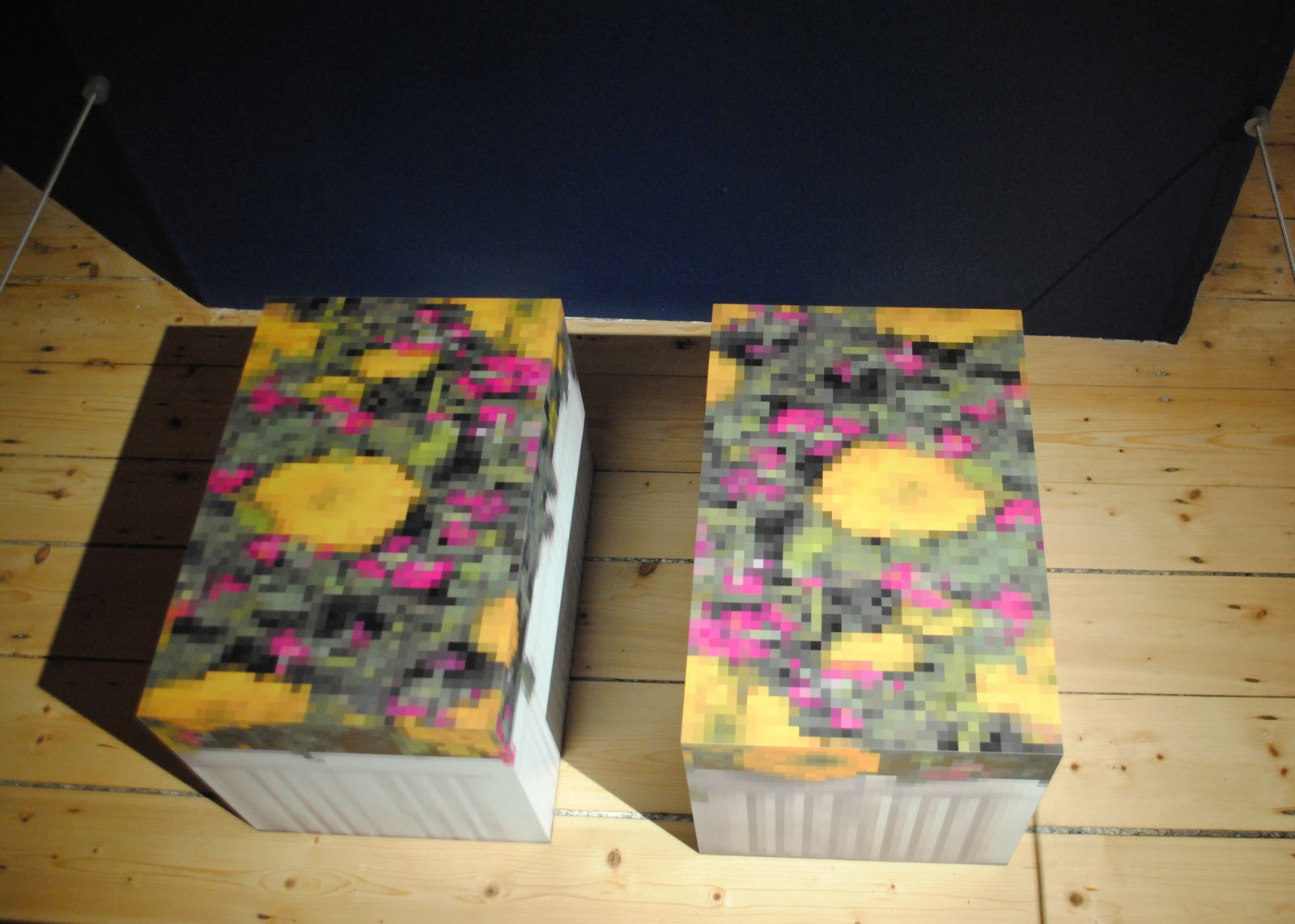
This was the piece we found most influential. We thought the
pixelation of the image and sculptural element could be used
in some aspect of combining reality (Manchester) with
animation (cartoons).
Below are some of our experimentations in response to our trip to Manchester. I came up with the idea of using red bricks to symbolise Manchester referencing its industrial past and the fact a bricks colour is dictated by the geography of the area. Therefore I felt this would work most effectively represented Manchester.
Iconic Photo

 Sigmund Freud. Me.
'Tonight Cat I'm going to be...' was a photography brief set to highlight the power of lighting and prop when it comes to taking a photo. The image I chose, Sigmund Freud by Max Halberstadt isn't necessarily iconic in the same way Andy Warhol is iconic in his red image with hair on end is. Yet the man, the period and photographer make this in my eyes and iconic image. Reluctantly I have to admit this wasn't quite as difficult to achieve as it initially looks. However, in many ways it illustrates the immense skill of photographic artists such as Gregory Crewdson (image below 'No Love Lost') in there production of such intricate image production. In his photo's he uses up to 80 prop and lighting crew members just to create a single photo.
 Gregory Crewdson's 'No Love Lost' shows a flooded set with
famous Hollywood actress Hillary Swank.
Gregory Crewdson's 'No Love Lost' shows a flooded set with
famous Hollywood actress Hillary Swank.
I Quite like the idea of introducing some of his ethics into my 'Dingbat' photo. A project set based around constructing a symbol (letter) from the type face, Zapf Dingbat (brief shown below).
A FALLING ZAPF
 Mine is the faintly highlighted 12
pointed star, 3rd row.
Mine is the faintly highlighted 12
pointed star, 3rd row.
My initial research produced a lot of information about the 12 pointed star being a religious symbol and used regularly throughout world culture. So I started thinking about the fact it was near Christmas and that I could do something related to the North Star with its religious connections to the baby Jesus. With this in mind I was walking across Peckham Rye near where I live and took the shot below. I felt the atmosphere created with the moon (and when dark, potentially stars as well) helped to emphasise this theme.
Peckham Rye, Photo - AH
So a week or so later I returned with shovel, camera, tripod, torch and ding pat and in hand and began to set my scene.
Final image.